News media websites, always among the most dynamic and widely-read places on the internet, are currently undergoing a design shift that is highly significant to the IT industry as a whole.
Last October, the BBC’s website, ranked by Alexa as the 49th most visited in the world, unveiled its new beta layout:

It’s interesting to look at the main changes made to the layout:
- Vertical scrolling was mostly replaced by a side-to-side horizontal motion.
- The “above the fold” part of the screen… the view presented to users on opening the screen… was optimized to a landscape layout. This part of the page is filled with the most current and dynamic content.
- Total vertical real estate was limited to just the same amount of screen again.
- Links are square, large and bold, rather than “traditional” single line HTML text hyperlinks.
- A prominent “What’s Popular” section appeared.
These design changes, of course, made the site much more tablet friendly. The portrait layout was perfectly sized to fit a typical tablet screen such as the iPad. Single line links are awkward on a tablet, often needing a very accurate finger jab or a pinch-and-zoom action. In contrast, a big square click area is much more touchscreen friendly. Mobile users are familiar and comfortable with the side-to-side swipe action to move between screens, so the new scrolling method suits them well. “What’s Popular” wasn’t a brand new concept in news websites, of course, but it’s a very familiar feature to users of mobile products like Apple’s App Store.
It was easy to suppose that the layout had been designed with mobility in mind, and the BBC Homepage Product Manager, James Thornett, confirmed this:
“It shares a design principle that we’ve seen in tablets and mobile phones and we’ve heard from reviewers during testing over the last couple of months that it feels quite natural to them”.
What was really interesting was Thornett’s subsequent statement:
“We’ve checked out the new page on our desktop computers as well as on our iPad 2 and we must say, it looks a little too simplified for the PC, but it suits the size and screen of a tablet device like the iPad perfectly.
I would expect you to see, within the course of the next few weeks, months and years, the rollout of the design front and this kind of interaction and style across all of our sites.”
In other words, we know it’s not what PC users are used to, but we’re going to progress this way anyway. And that’s not a bad decision, because it’s better to be slightly simple on one device, and optimized for another, than to be very ill-suited to one of them. It goes a step further than simply providing a “mobile” version of the site, formatted for small telephone screens, and asking tablet users to choose between two bad options.
The BBC seem confident that this is the correct path to take. At present, their sites are still in some degree of transition. The beta layout has become the primary layout for the main BBC site. The BBC news site retains its old desktop layout, while its sport section has a much more mobile-optimized interface:

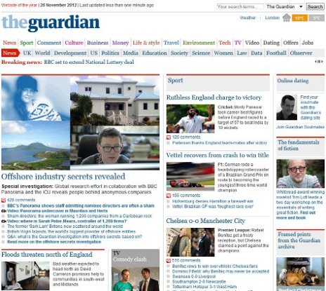
Many other websites are undergoing similar transitions, and it can be interesting exploring for unpublicized “beta” versions. For example, here is the current website of the Guardian newspaper:

However, navigating to the largely unpublicised http://beta.guardian.co.uk reveals an experimental tablet-friendly view that is much more radical than the BBC’s transformed pages:

The media industry’s transition is still very much in progress, and some media companies are moving faster are more effectively than others. ABC News is already optimised pretty well for mobile devices, with links given reasonable space for jabbing at with a heavy finger. CNN, on the other hand, are trying, but still present huge numbers of tiny links, to vast amounts of content. Even their Beta tour suggests that they’re struggling to shake this habit:

Tablets sales are carving a huge chunk out of the PC market and will inevitably outsell them, according to Microsoft, Apple, and most other commentators. This is driving a simple but profound change: users want to swoosh and scroll, to click links with their finger rather than a mouse pointer. They want interfaces that work in portrait and landscape, and align themselves appropriately with the simple rotation of a device. This will become the normal interface, and sites and services which insist on depending on “old” interface components like scrollbars, flat text links, and fiddly drop down menus, will be missing the point entirely.
