Mobile ITSM isn’t only about field support: It’s about everyone.

iPhone 6

When we built the new Smart IT UX for BMC Remedy, we were determined to allow ALL IT Support Workers to be Mobile. Why? Because everyone can benefit from mobility.

In the short history of enterprise mobility, mobile business applications have generally focused on two specific user groups. The first is the group of users for whom being on the road is the bulk of their job, such as field engineers: they go to a location, perform some tasks, move on to the next place.

The second group is those who might be based at a desk in an office, but who move around through a series of meetings, on and off-site. For these users, the primary purpose of mobility has been continuity of communication (with the weapon of choice having historically been the keyboard-equipped Blackberry).

For most other users, performing most other business tasks, the desktop computer (or desk-based notebook computer) still remained the key delivery mechanism for business applications.

Today, this is an outdated philosophy.

I recently stood in a lift at a customer’s office. There were four people in that elevator, and there were seven smartphones on display.  Okay, two of them were mine (I’m a mobility product manager, after all), but that is still a notable average.

Even in the short moment offered by a journey of just a few floors, those office-based employees found a moment to communicate. Whether that communication was work-based or personal, one-way or two-way, is irrelevant. The point is that the time was being used to perform those tasks in a way that could not have happened just a few years ago.

In the December 2014/January 2015 edition of Fast Company, Larry Erwin, a Business Development Executive with Google, points out:

“When I was a kid growing up back in the ’90s, I was the only kid on my block with a Tandy 1000. Now kids who are 15, 16 years old have a supercomputer in their pocket”

The opportunity for business software tools to take advantage of that new computing power is huge, and growing. The very structure of the traditional office is under pressure, as users become more mobile and more technology enabled. That generation of teenagers will soon enter the workplace having had a completely different, and more universal grounding in technology than we select geeks who owned the Tandy 1000s and Sinclair Spectrums of yesteryear.

Mobility has already become a primary means of service consumption for customers, across a swathe of industries. Consider the process of taking a flight: with many airlines, the entire customer experience has been mobilized. Forrester Research outlined this beautifully in a 2014 illustration charting the timeline of mobile engagement for the airline passenger:

  • -2 Weeks: Book ticket, change reservation
  • -2 Days: Change seat, request upgrade
  • -2 Hours: Check in, check gate, departure time, lounge access
  • Flight: Arrival time, food order, movies, wi-fi, duty free
  • +2 Hours: Ground transport, lost luggage, navigation
  • +2 Days: Mileage status, reward travel, upcoming reservations
  • +2 Weeks: Mileage points earned, customer satisfaction survey
    (Source: Forrester)

Mobility for the consumer is now table stakes. So why not extend this to the people serving those consumers? Mobility, simply, provides great opportunities to enhance the role of the service representative.

When I arrived at a Westin Hotel in Chicago last month, I needed to speak with reception, and joined the line of people at the check-in desk. However, I was approached by a staff member with an iPad. They were quickly able to answer my question. The Starwood Hotels group, he told me, aims to keep its hotel staff on their feet, closer to customers, delivering service in a more dynamic way. Even the group’s CEO, Fritz van Paasschen, has abandoned his desk and PC: a Wall Street Journal article in November 2014 revealed that he works entirely on tablet and smartphone (van Paasschen’s office contains no desk – just a boardroom table and a couch).

In an IT Service Management environment, the case for mobility for field support users has long been clear: the alternative being a hotch-potch of printed dockets, slow communication, and inconvenient (or omitted) retrospective updates to systems of record, back at a field office.

But even in the office, it’s important to realise that good IT service, like all good customer service, combines communication, expertise, initiative and process. Many people involved in that process are not at their desk all day: they may be in meetings, or travelling between sites, or sitting with colleagues.

If those people can only access their support tools from their desk, then gaps appear. Twenty minutes waiting for input from an approver or technical expert could amount to twenty minutes more waiting time for the customer, or even a missed window to communicate with the next person in the chain (and hence an even bigger gap). Mobilising people – properly – fills those gaps, even in the office. And, as the IT department’s customers get more mobile, the best way to support them is often to become more mobile.

When we built the Smart IT interface for BMC Remedy, released in September 2014, this was the philosophy of our mobile approach: ITSM should be mobile for every user, whether they are field support technicians roaming a wide area, or a service desk agent taking a five minute break at the coffee machine.

The tool needed to provide all the features they need, including comprehensive teamwork features and assistiveness, so that they are never forces to find a desk or wait for the slow boot-up of a traditional PC. We released the tablet version of Smart IT on day one, and the phone version, scheduled to be live in December 2014, has been already received a great reception in demonstrations at customer events. As with Smart IT in general, there’s no additional cost over and above a standard Remedy ITSM license.

Our work with our ITSM customers has shown us, and them, that there are huge and real business benefits to seamless and comprehensive mobile experience. Time not spent in front of a PC no longer needs to be time spent not helping customers.

Properly equipped, an increasingly mobile-focused user base is sure to find those benefits, and that means faster, better outcomes for IT’s customers.

Advertisement

Notes from the CITE 2013 Conference in San Francisco

Logo of CITE (Consumerization of IT in the Enterprise)

Last Monday (3rd June 2013) I was fortunate to be able to attend the first of two days at the Consumerization of IT in the Enterprise (CITE) conference at the Marriott Marquis in San Francisco, CA.  This was the conference’s second year, and drew a healthy attendance of delegates, many of them CIOs and CTOs for significant organizations.  Consumerization is here, and IT executives are realizing the importance of embracing it.

My employer, BMC Software, was present as a sponsor, and was demonstrating several products including our new end-user-focused product MyIT.  In addition to some time in the booth, however, I was also able to attend a full day of conference sessions, and with a strong agenda it was often difficult to choose between overlapping meetings.

Some highlights:

Metrics from IT Consumerization’s frontline

IDG Enterprise’s Bob Melk (@bobmelk) presented key findings from his organization’s 2013 report on the consumerization of IT in the enterprise. Some important points from the presentation include:

  • Asked about the top challenges arising from consumerization, the most popular answer, from over 82% of large organizations was security, followed by privacy and compliance issues (65%) and lack of control (53%).
  • One challenge that was not called out by the majority of organizations was the inability to measure ROI. 69% of large enterprises responded that this was not a top challenge.
  • Within the scope of security, the biggest challenges called out were the difficulty of installing controls on user devices (54% for large enterprises), and the difficulty of integrating devices with existing security systems (44%)
  • Asked if they were confident that they were ready to increase access to consumer technologies in the workplace, only 15% reported that they were “very confident”. 45%, however, responded that they were “somewhat confident”.  Interestingly, this has doubled since the 2011 survey.
  • Productivity is an objective: More than half of the respondents are looking to achieve increased productivity and better employee access to work materials anytime/anywhere.

Cisco – “Not so much the Internet of Things, as the Internet of Everything!

A fascinating presentation by Cisco’s Marie Hattar (@MarieHattar) pointed out that over 99% of the things that could be connected to the internet still aren’t.  That’s 1.5 trillion things, of which 96.5% are consumer objects. Putting it another way, it’s 200 connectable things per person*.  This, Cisco believe, is a $14.4 trillion market just waiting to be addressed, a case set out in more detail in their white paper here.  We are already in the age of the “Internet of Things”, they argue. The “Internet of Everything” is the next step on the journey.

(*my brilliant colleague Chris Dancy (@ServiceSphere) probably gets close to that number with a single arm, but we should probably place him amongst the leaders on this metric.  You can watch him on this subject at the SDI conference in Birmingham, UK, on 19th June. More details here).

Panel Discussion – The Social Enterprise

In an interesting panel discussion alongside Kevin Jones (@KevinDJones) and Ted Shelton (@tshelton), Tom Petrocelli (@tompetrocelli) of ESG Global argued that the traditional hierarchical organization is changing.  This is a challenge to those who might normally move up the hierarchy, if it is not in their interest for their organizations to transform into a more disparate, networked structure. Social enterprise, according to Petrocelli, is not so much a technical challenge as a management one (edit at 8:16PM BST 10th June 2013: Tom has tweeted me with what I think is a useful addition: “Remember, though collaboration is a management problem and technology isn’t the answer, it is part of the answer”).

“Crapplications”

Brian Katz (@bmkatz) of Sanofi presented an entertaining analysis of good and bad mobile applications.

A very detailed mobile UI application (photo from Brian Katz's presentation at CITE 2013)
Brian Katz presented examples of good and bad mobile UIs. Guess which category this fell into?

There was a strong message too: “If you don’t have a mobile strategy, you don’t have a strategy”. Brian’s view is that organizations should develop their apps on mobile, then bring them to tablets and desktops. Microsoft Word, for instance, has hundreds of features, which would make no sense to a user of an iPad application.

The great HTML5/Native debate

From a mobile applications point of view, one thing that was abundantly clear is that there is still no consensus on the HTML5-versus-Native debate.  TradeMonster’s CIO, Sanjib Sahoo (@SahooSanj) put a passionate and solid case for the former. An HTML5 approach enabled them to deploy a trading application more quickly and less expensively than their competitors. Their app is strongly rated by users, and Sanjib spoke of HTML5 being seen as a “great long term strategy”, while acknowledging difficulties such as memory footprint, and the fact that HTML5 is not yet a true cross-platform technology.  He also pointed out that the limited data cache available to HTML5 applications compared to truly native applications is not really a problem for real-time trading applications where live data is the key requirement. For other requirements, it’s definitely more of a factor.

Socialized Media: The shift to mobile

News media websites, always among the most dynamic and widely-read places on the internet, are currently undergoing a design shift that is highly significant to the IT industry as a whole.

Last October, the BBC’s website, ranked by Alexa as the 49th most visited in the world, unveiled its new beta layout:

BBC website layout - new and old
The BBC’s new website layout (left) and its previous incarnation (right). Click for bigger.

It’s interesting to look at the main changes made to the layout:

  • Vertical scrolling was mostly replaced by a side-to-side horizontal motion.
  • The “above the fold” part of the screen… the view presented to users on opening the screen… was optimized to a landscape layout.  This part of the page is filled with the most current and dynamic content.
  • Total vertical real estate was limited to just the same amount of screen again.
  • Links are square, large and bold, rather than “traditional” single line HTML text hyperlinks.
  • A prominent “What’s Popular” section appeared.

These design changes, of course, made the site much more tablet friendly.  The portrait layout was perfectly sized to fit a typical tablet screen such as the iPad. Single line links are awkward on a tablet, often needing a very accurate finger jab or a pinch-and-zoom action. In contrast, a big square click area is much more touchscreen friendly. Mobile users are familiar and comfortable with the side-to-side swipe action to move between screens, so the new scrolling method suits them well.  “What’s Popular” wasn’t a brand new concept in news websites, of course, but it’s a very familiar feature to users of mobile products like Apple’s App Store.

It was easy to suppose that the layout had been designed with mobility in mind, and the BBC Homepage Product Manager, James Thornett, confirmed this:

“It shares a design principle that we’ve seen in tablets and mobile phones and we’ve heard from reviewers during testing over the last couple of months that it feels quite natural to them”.

What was really interesting was Thornett’s subsequent statement:

“We’ve checked out the new page on our desktop computers as well as on our iPad 2 and we must say, it looks a little too simplified for the PC, but it suits the size and screen of a tablet device like the iPad perfectly.

I would expect you to see, within the course of the next few weeks, months and years, the rollout of the design front and this kind of interaction and style across all of our sites.”

In other words, we know it’s not what PC users are used to, but we’re going to progress this way anyway.  And that’s not a bad decision, because it’s better to be slightly simple on one device, and optimized for another, than to be very ill-suited to one of them.  It goes a step further than simply providing a “mobile” version of the site, formatted for small telephone screens, and asking tablet users to choose between two bad options.

The BBC seem confident that this is the correct path to take. At present, their sites are still in some degree of transition. The beta layout has become the primary layout for the main BBC site. The BBC news site retains its old desktop layout, while its sport section has a much more mobile-optimized interface:

BBC news and sport layout November 2012
BBC’s current News and Sport layouts. Note that the Sport layout (on the right) is better optimised for tablets and mobile devices than the News layout

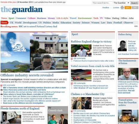
Many other websites are undergoing similar transitions, and it can be interesting exploring for unpublicized “beta” versions. For example, here is the current website of the Guardian newspaper:

Guardian newspaper desktop layout
The current, desktop friendly version of the Guardian Newspaper’s homepage (November 2012)

However, navigating to the largely unpublicised http://beta.guardian.co.uk reveals an experimental tablet-friendly view that is much more radical than the BBC’s transformed pages:

The Guardian Beta layout in November 2012
The Guardian Beta layout in November 2012, tucked away at beta.guardian.co.uk

The media industry’s transition is still very much in progress, and some media companies are moving faster are more effectively than others. ABC News is already optimised pretty well for mobile devices, with links given reasonable space for jabbing at with a heavy finger. CNN, on the other hand, are trying, but still present huge numbers of tiny links, to vast amounts of content.  Even their Beta tour suggests that they’re struggling to shake this habit:

CNN's Beta site
CNN’s Beta walkthrough. Better sharpen those fingertips.

Tablets sales are carving a huge chunk out of the PC market and will inevitably outsell them, according to Microsoft, Apple, and most other commentators. This is driving a simple but profound change: users want to swoosh and scroll, to click links with their finger rather than a mouse pointer.  They want interfaces that work in portrait and landscape, and align themselves appropriately with the simple rotation of a device. This will become the normal interface, and sites and services which insist on depending on “old” interface components like scrollbars, flat text links, and fiddly drop down menus, will be missing the point entirely.

The Phenomenal Success of Strava

Endurance sports may not be the most obvious place to find a social media revolution. There is no fixed time window for a bike ride:  Some people are limited to weekends; others may grab a spare hour in the early morning, or pack a ride into their lunchtime. For a few, it’s a day job.

For many of us weekend warrior mountain bikers, organized competition, with a mass of participants, is something we might only dabble with once in a while.  Bike riding is typically more about getting out in the sunshine (or, here in southern England, the gloom), burning off a bit of sedentary-career belly, and having some fun. Most miles are ridden pretty much alone or in small groups

One thing that’s certain, however, is that cyclists are voracious adopters of technology. We love carbon things, and shiny things, and faster things. Technical innovation is a big part of the professional sport, and that element trickles strongly down to the recreational level, at a relatively affordable price compared to other technology-focused sports such as motor racing.

It’s perhaps no suprise, then, that cyclists were very early adopters of recreational GPS devices. Many of us are map geeks, but that still doesn’t mean we want to have to retrieve a soggy scrap of paper from the tree it has just blown into for the third time.

This trend started in 2000 with a mini-revolution, brought about by a key policy change. On May 1st, US President Bill Clinton turned off selective availability, an artificial wobbling error which had deliberately reduced the accuracy of the non-military Global Positioning System signal. For the first time, consumers could fix their location not just to a vague area of a few hundred metres, but right to the very trail they were standing on, walking along, or cycling up.

President Clinton’s move drove the huge success of generation of cheap, rugged handheld GPS devices like the Garmin Etrex, launched that same year.  As the decade progressed, these gadgets increasingly began to adorn bike handlebars and hike backpacks.

Garmin's original "Yellow Etrex"
Garmin’s original “Yellow Etrex”, launched in 2000

These gadgets didn’t just bring easier navigation… they brought tracking and logging. Riders keenly compiled their own statistics, and were able to share routes easily with others. A new outdoor-focused software industry sprang up, with companies like Anquet, Memory Map and Tracklogs combining detailed mapping with GPS connectivity to make the best of those basic early devices.

The sophistication of recreational GPS units continued to increase, but it was a trend that would soon be overwhelmed by a new development. In 2007, smartphones phones such as Nokia’s N95 began to be shipped with built in GPS units. Suddenly, people didn’t have to buy a navigation device to take advantage of GPS navigation. It was right there in their pocket. And while recreational GPS units had shipped by the million, smartphones ship by the hundreds of millions, every year. .

From a gadgetry point of view, the trend has pushed Garmin towards a more specialist sporting GPS market, with high-end devices featuring integrated heart-monitors, cadence (pedalling rate) sensors and more. The associated software, meanwhile, made an inevitable shift to the mobile device market, and a flood of applications hit the online stores.

The concept, of course, is pretty simple. Launch the app. Press “Start” at the beginning of a walk, or bike ride, or jog, or swim. Hmm, perhaps not a swim. Put phone in safe pocket. Press “End” at the end. The application measures the GPS log, overlays it with public or commercial mapping data, and calculates metrics such as distance, elevation gain, and time.  It’s all saved to a log of the person’s activities, enabling them to repeat routes, compare previous activities, and view overall achievements and stats.  Most of these apps look pretty similar, and there are plenty of them, as any quick App Store search will reveal.

This now brings us to Strava.

Strava was publically launched in 2009 (although there are rides logged dating back to the spring of 2008).  It was the brainchild of two Harvard alumni, Michael Horvath and Mark Gainey.  The concept was pretty standard – Strava is a ride logging system that interfaces with a smartphone’s GPS via a native app, or takes a website upload from recreational GPS devices.

Strava showed from early on that they had some new ideas. They introduced a neat feature called the KOM, or “King of the Mountain”. Named after the prize given to the best mountain climber in professional events such as the Tour de France, KOMs were originally awarded to riders who’d made the fastest ascent of pre-defined climbs.

In August of 2009, they made a huge decision, which would really set them down the path of being a bit different to the crowd. The KOM concept was cleverly expanded, as described in this entry on the Strava Blog:

“Until this release, Strava processed ride data in such a way that it could identify when you had ridden a categorized climb and match it with previous efforts on the same climb. That allowed us to show you the “KOM” standings for categorized climbs, for example. Many of you have suggested that we expand this concept to more than just categorized climbs. The new data model will allow just that. In the coming weeks you will be able to name and compare your effort on any section of trail or road with a previous effort in our database on the same section.”

Now, any rider could create any segment and start to register times on it. That long, fast and rather boring stretch of road on your commute suddenly became a sporting battle waged against a set of otherwise invisible opponents. The Strava leaderboard was born:

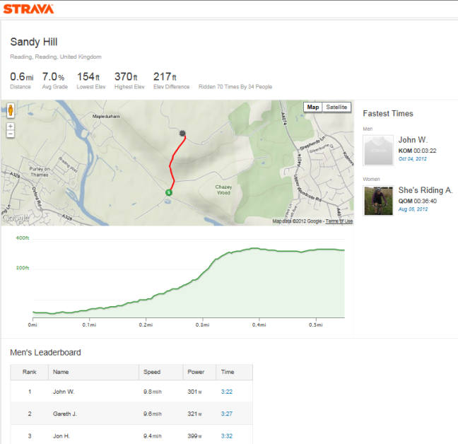
Strava leaderboard for Sandy Hill, Oxfordshire
Part of Strava’s leaderboard for Sandy Hill, near Reading.Yes, that’s me in 3rd, and yes, I want my KOM back.

Strava has differentiated itself by turning what was previously a solo experience into a shared one. The gentle pseudo-competition of competing for KOMs is addictive, fun, and much easier and cheaper than entering and travelling to races. The use of simple social network features like friend lists, chat, and “Kudos” (a simple thumbs up to convey one’s admiration of another rider’s achievements) have built a thriving community.  They’ve cleverly signed up big name riders like the USA’s Taylor Phinney, so users can follow the achievements of the pros (and feel mildly inadequate at the gulf between our abilities and theirs!).

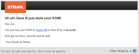
In the process, they’ve motivated a lot of people to ride more, not least through some neat little tricks. We work hard to secure a KOM, and finally get there, only for the “Uh oh!” email to pop into our mailbox a short while later, breaking the bad news to us that we’ve been beaten. Perhaps we’d like to get out there and have another go?

Strava lost KOM email
Uh oh!

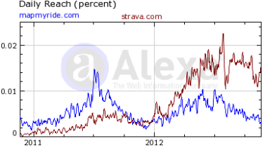
Strava is a classic story of a commodity concept being revolutionized by Social Media. In 2011, the influential VeloNews magazine voted Strava their technical innovation of the year (no mean feat in a high-income-demographic sport sector, full of carbon fibre and titanium bling).  Alexa’s site stats show how they have comfortably passed some of 2011’s big names like MapMyRide (who in 2012 have been trying to play catch-up on the leaderboard model). Even the seasonal northern hemisphere winter slump doesn’t significantly dent a very strong growth. I fully expect next summer to see them rocketing northwards.

Image

This growth is impressive particularly because this segment should really have inertia on its side. After building up a set of logs on one site, there’s a strong incentive to stay there, particularly when it’s not always easy to move data to a new site (as noted with some light hearted profanity in articles like this one). Strava is compelling enough to make users walk away and start again.

Importantly, Strava has embedded itself in the consciousness of recreational cyclists. It is THE talked about app on the forums, and appears to be reaching an important critical mass whereby it is normal for hobbyist cyclists to have an account.  Participants are committed and enthusiastic: A recent challenge on the Strava site encouraged riders to attempt a 79 mile ride over one three-day weekend. They got almost 11,000 signups, of whom an amazing 7,000 successfully completed the task.  Strava is a social and motivational phenomenon.

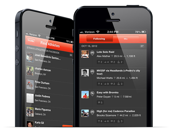
Strava's iphone app
Strava’s latest iPhone app is packed full of social features and content

Socialization is an incredibly powerful, market-changing concept. It’s there to be harnessed: our users now carry better gadgets than our companies ever lent them, and they interact with them in more aspects of their lives than the IT industry ever really imagined they would.

People like to collaborate, compare, convey their stories and experiences. They like to see the admire the achievements of others and to learn what is achievable. It’s motivating and it’s fun.

These concepts are a huge disruptor. They have changed sector after sector, and they’ll change ours.