Cloud’s impact on ITSM tools: it’s not just about SaaS

Image of clouds in a deep blue sky

The last few years in the ITSM toolset market have been somewhat dominated by the subject of cloud delivery. Business has, of course, rapidly embraced the cloud as an application consumption option. ITSM has been no exception: new entrants and established brands alike have invested either in fully SaaS offerings, or in diversification of their offering to provide a choice between on-premise and cloud delivery models.

However, for the users of those tools, or their customers in the wider organisation using SaaS software, the delivery method alone does not necessarily change much. This is hugely important to remember. If software is consumed via a URL, it does not particularly matter whether the screens and features are served from the company’s own servers, or from a data centre halfway across the country or even the world.  There are often points of benefit for the SaaS end user, of course. But the mechanism alone? It’s a big deal for the buyer, or for the people managing the system, but it might be wholly transparent to everyone else.

It’s important, therefore, to look at what the real differences are to those real-life users: the people whose jobs are constantly underpinned by the applications. Now that we have a solid set of SaaS platforms underpinning ITSM, it seems right to focus on where cloud has already created dramatic user benefits outside the ITSM space. These huge trends show us what is possible:

Autonomy: When an employee stores or shares files using a cloud storage provider like Dropbox, they are detaching them from the traditional corporate infrastructure of hard drives, email, and groupware. When they use their own smartphone or tablet at work, as more than 80% of knowledge workers are doing, they are making a conscious decision to augment their toolset with technology of their own choice, rather than their company’s.

Collectivisation: Cloud applications have the potential to pull broad user groups together in a manner that no closed corporate system can ever hope to do. In the consumer space, this is the key difference between crowdsourced guidance and point expert advice (a battle in which the momentum is only going one way: as evidenced by numerous examples such as the disruption of the travel guide book market by Yelp and TripAdvisor). Aggregated information and real time interaction are new and powerful disruption to traditional tools and services, and Cloud is a huge enabler of these.

Communication: Facebook’s impact on social communication has been to close down distances and seamlessly bring groups of people together in an effortless manner. In a similar manner, Cloud platforms give us new ways to link disparate ITSM actors (whether customers or deliverers) across multiple systems, locations and organizations, without the requirement to build and maintain multiple, expensive ad-hoc paths of communication, and without some of the drawbacks of traditional channels such as email. Service, at least when things get complicated, is a team effort, and slick communication underpins that effort.

Cross-Platformity: Cloud underpinnings have enabled a new generation of applications to work seamlessly across different devices. An employee on a customer visit can use a tool like Evernote to dictate stand-up notes using a smartphone, before editing them on the train home using a tablet, and retrieving them on the laptop in the office the next morning. Nothing needs to be transferred: there is no fiddling with SD Cards or emails.

These are the principles which will change the game for ITSM’s front line service providers, and it’s customers. Bringing some or all of them together opens up a huge range of possibilities:

  • Integrated service platforms, connecting the customer in new ways to those serving them (think of the “two halves of Uber”, for instance: separate applications for passenger and driver, with powerful linkage between the two for geolocation, payment and feedback).
  • Fully mobilised ITSM, delivering a truly cross platform “Evernote” experience with persistent personal data such as field notes.
  • Easy application linkages, driven by tools like IFTTT and Zapier, opening up powerful but controllable autonomy and user-driven innovation.
  • Integrated community interaction beyond the bounds of the single company instance, enabling knowledge sharing and greater self-help.
  • Highly contextual and assistive features, underpinned by broad learning of user needs and behaviours across large sets of users, and detailed analysis of individual patterns.
  • Open marketplaces for granular services and quick “plug and play” supplier offerings, rapidly consumed and integrated through open cloud-driven toolsets.
  • New collaboration spaces for disparate teams of stakeholders, bringing the right people together in a more effective way, to get the job done.

Autonomy, collectivisation, communication, cross-platformity: these are four key principles that are truly making a difference to ITSM. Cloud delivery is just the start.  It is now time to harness the real frontline benefits of this technological revolution.
 

Cloud image: https://www.flickr.com/photos/aztlek/2357990839.  Used under Creative Commons licensing.
Advertisement

Socialized Media: The shift to mobile

News media websites, always among the most dynamic and widely-read places on the internet, are currently undergoing a design shift that is highly significant to the IT industry as a whole.

Last October, the BBC’s website, ranked by Alexa as the 49th most visited in the world, unveiled its new beta layout:

BBC website layout - new and old
The BBC’s new website layout (left) and its previous incarnation (right). Click for bigger.

It’s interesting to look at the main changes made to the layout:

  • Vertical scrolling was mostly replaced by a side-to-side horizontal motion.
  • The “above the fold” part of the screen… the view presented to users on opening the screen… was optimized to a landscape layout.  This part of the page is filled with the most current and dynamic content.
  • Total vertical real estate was limited to just the same amount of screen again.
  • Links are square, large and bold, rather than “traditional” single line HTML text hyperlinks.
  • A prominent “What’s Popular” section appeared.

These design changes, of course, made the site much more tablet friendly.  The portrait layout was perfectly sized to fit a typical tablet screen such as the iPad. Single line links are awkward on a tablet, often needing a very accurate finger jab or a pinch-and-zoom action. In contrast, a big square click area is much more touchscreen friendly. Mobile users are familiar and comfortable with the side-to-side swipe action to move between screens, so the new scrolling method suits them well.  “What’s Popular” wasn’t a brand new concept in news websites, of course, but it’s a very familiar feature to users of mobile products like Apple’s App Store.

It was easy to suppose that the layout had been designed with mobility in mind, and the BBC Homepage Product Manager, James Thornett, confirmed this:

“It shares a design principle that we’ve seen in tablets and mobile phones and we’ve heard from reviewers during testing over the last couple of months that it feels quite natural to them”.

What was really interesting was Thornett’s subsequent statement:

“We’ve checked out the new page on our desktop computers as well as on our iPad 2 and we must say, it looks a little too simplified for the PC, but it suits the size and screen of a tablet device like the iPad perfectly.

I would expect you to see, within the course of the next few weeks, months and years, the rollout of the design front and this kind of interaction and style across all of our sites.”

In other words, we know it’s not what PC users are used to, but we’re going to progress this way anyway.  And that’s not a bad decision, because it’s better to be slightly simple on one device, and optimized for another, than to be very ill-suited to one of them.  It goes a step further than simply providing a “mobile” version of the site, formatted for small telephone screens, and asking tablet users to choose between two bad options.

The BBC seem confident that this is the correct path to take. At present, their sites are still in some degree of transition. The beta layout has become the primary layout for the main BBC site. The BBC news site retains its old desktop layout, while its sport section has a much more mobile-optimized interface:

BBC news and sport layout November 2012
BBC’s current News and Sport layouts. Note that the Sport layout (on the right) is better optimised for tablets and mobile devices than the News layout

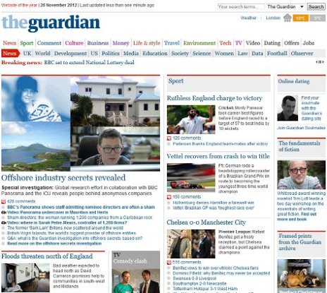
Many other websites are undergoing similar transitions, and it can be interesting exploring for unpublicized “beta” versions. For example, here is the current website of the Guardian newspaper:

Guardian newspaper desktop layout
The current, desktop friendly version of the Guardian Newspaper’s homepage (November 2012)

However, navigating to the largely unpublicised http://beta.guardian.co.uk reveals an experimental tablet-friendly view that is much more radical than the BBC’s transformed pages:

The Guardian Beta layout in November 2012
The Guardian Beta layout in November 2012, tucked away at beta.guardian.co.uk

The media industry’s transition is still very much in progress, and some media companies are moving faster are more effectively than others. ABC News is already optimised pretty well for mobile devices, with links given reasonable space for jabbing at with a heavy finger. CNN, on the other hand, are trying, but still present huge numbers of tiny links, to vast amounts of content.  Even their Beta tour suggests that they’re struggling to shake this habit:

CNN's Beta site
CNN’s Beta walkthrough. Better sharpen those fingertips.

Tablets sales are carving a huge chunk out of the PC market and will inevitably outsell them, according to Microsoft, Apple, and most other commentators. This is driving a simple but profound change: users want to swoosh and scroll, to click links with their finger rather than a mouse pointer.  They want interfaces that work in portrait and landscape, and align themselves appropriately with the simple rotation of a device. This will become the normal interface, and sites and services which insist on depending on “old” interface components like scrollbars, flat text links, and fiddly drop down menus, will be missing the point entirely.

Great service can come from simple ideas

Simple Idea, Great Service

This isn’t ITSM, but it’s a lovely example of a simple, quick idea that delivers real value.

My home town of Reading is served by a pretty good local public transport network. A number of its modern, double-decker bus routes serve the town’s Railway station, a major national rail interchange.

However, this is Great Britain, where almost every piece of transport infrastructure is run by a different company to the one next to it. They are not well known for working well together, and services and information are usually very disjointed.

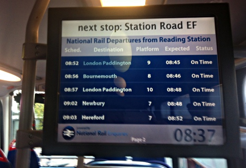
These screens on Reading’s buses predominantly show advertising. Recently, though, as buses near the railway station, this screen has begun to appear.

It’s nothing more than a quick, realtime view of upcoming train departures, something that can be sourced from the National Rail website.

It’s a simple but clever idea, probably relatively straightforward to implement on a wi-fi enabled bus (I told you we had a good bus network!).  Reading is a commuter-town, and now we know about the status of the service before we’ve arrived (which can be important on a day like today!). We know whether we have time to grab that coffee, or whether we need to rush for the next fast train.

This speaks to me of a company that has really thought about its customers. It puts valuable information right in front of the the people who need it, at the precise moment they need it. Simple, easy, and very effective.