Let’s work together to fix ITAM’s image problem

Intel Datacenter

Intel Datacenter

This is a long article, but I hope it is an important one. I think IT Asset Management has an image problem, and it’s one that we need to address.

I want to start with a quick story:

Representing BMC software, I recently had the privilege of speaking at the Annual Conference and Exhibition of the International Association of IT Asset Managers (IAITAM).  I was curious about how well attended my presentation would be. It was up against seven other simultaneous tracks, and the presentation wasn’t about the latest new-fangled technology or hot industry trend. In fact, I was concerned that it might seem a bit dry, even though I felt pretty passionate that it was a message worth presenting.

It turned out that my worries were completely unfounded.  “Benchmarking ITAM; Understand and grow your organization’s Asset Management maturity”  filled the room on day 1, and earned a repeat show on day 2. That was nice after such a long flight. It proved to be as important to the audience as I hoped it would be.

I was even more confident that I’d picked the right topic when I’d finished my introduction and my obligatory joke about the weather (I’m British, it was hot, it’s the rules), I asked the first few questions of my audience:

“How many of you are involved in hands-on IT Asset Management?”

Of the fifty or so people present, about 48 hands went up.

“And how many of you feel that if your companies invested more in your function, you could really repay that strongly?”

There were still at least 46 hands in the air.

IT Asset Management is in an interesting position right now.  Gartner’s 2012 Hype Cycle for IT Operations Management placed it at the bottom of the “Trough of Disillusionment”… that deep low point where the hype and expectations have faded.  Looking on the bright side, the only way is up from here.

It’s all a bit strange, because there is a massive role for ITAM right now. Software auditors keep on auditing. Departments keep buying on their own credit cards. Even as we move to a more virtualized, cloud-driven world, there are still flashing boxes to maintain and patch, as well as a host of virtual IT assets which still cost us money to support and license. We need to address BYOD and mobile device management. Cloud doesn’t remove the role of ITAM, it intensifies it.

There are probably many reasons for this image problem, but I want to present an idea that I hope will help us to fix it.

One of the massive drivers of the ITSM market as a whole has been the development of a recognized framework of processes, objectives, and – to an extent – standards. The IT Infrastructure Library, or ITIL, a huge success story for the UK’s Office of Government Commerce since its creation in the 1980s.

ITIL gave ITSM a means to define and shape itself, perfectly judging the tipping point between not-enough-substance and too-much-detail.

Many people, however, contend that ITIL never quite got Asset Management. As a discipline, ITAM evolved in different markets at different times, often driven by local policies such as taxation on IT equipment. Some vendors such as France’s Staff&Line go right back to the 1980s. ITIL’s focus on the Configuration Management Database (CMDB) worked for some organizations, but was irrelevant to many people focused solely on the business of managing IT assets in their own right.  ITIL v3’s Service Asset Management is arguably something of an end-around.

However, ITIL came with a whole set of tools, practices and service providers that helped organizations to understand where they currently sat on an ITSM maturity curve, and where they could be. ITIL has an ecosystem – and it’s a really big one.

Time for another story…

In my first role as an IT professional, back in 1997, I worked for a company whose IT department boldly drove a multi-year transformation around ITIL. Each year auditors spoke with ITIL process owners, prodded and poked around the toolsets (this was my part of the story), and rated our progress in each of the ITIL disciplines.

Each year we could demonstrate our progress in Change Management, or Capacity Management, or Configuration Management, or any of the other ITIL disciplines. It told us where we were succeeding and where we needed to pick up. And because this was based on a commonly understood framework, we could also benchmark against other companies and organizations. As the transformation progressed, we started setting highest benchmark scores in the business. That felt good, and it showed our company what they were getting for their investment.

But at the same time, there was a successful little team, also working with our custom Remedy apps, who were automating the process of asset request, approval and fulfillment.  Sadly, they didn’t really figure in the ITIL assessments, because, well, there was no “Asset Management” discipline defined in ITIL version 2. We all knew how good they were, but the wider audience didn’t hear about them.

Even today, we don’t have a benchmarking structure for IT Asset Management that is widely shared across the industry. There are examples of proprietary frameworks like Microsoft’s SAM Optimization Model, but it seems to me that there is no specific open “ITIL for ITAM”.

This is a real shame, because Benchmarking could be a really strong tool for the IT Asset Manager to win backing from their business. There are many reasons why:

  • Benchmarking helps us to understand where we are today.
  • More importantly, it helps us to show where we could get, how difficult and expensive that might be, and what we’re missing by not being there.

Those two points alone start to show us what a good tool it is for building a case for investment. Furthermore:

  • Asset Management is a very broad topic. If we benchmark each aspect of it in our organizations, we can get a better idea of where our key strengths and weaknesses are, and where we should focus our efforts.
  • Importantly, we can also show what we have achieved. If Asset Management has an image problem, then we need a way to show off our successes.

And then, provided we work to a common framework…

  • Benchmarking gives us an effective way of comparing with our peers, and with the best (and worst!) in the industry.

At the IAITAM conference, and every time I’ve raised this topic with customers since, there has been a really positive response. There seems to be a real hunger for a straightforward and consistent way of ranking ITAM maturity, and using it to reinforce our business cases.

For our presentation at IAITAM, we wanted to have a starting point, so we built one, using some simple benchmarking principles.

First, we came up with a simple scoring system. “1 to 4” or “1 to 5”, it doesn’t really matter, but we went for the former.  Next, we identified what an organization might look like, at a broad ITAM level, at each score. That’s pretty straightforward too:

Asset Maturity – General Scoring Guidelines

  • Level 1: Little or no effective management, process or automation.
  • Level 2: Evidence of established processes, automation and management.  Partial coverage and value realization. Some automation.
  • Level 3: Fully established and comprehensive processes. Centralized data repository. Significant
    automation.
  • Level 4:  Best-in class processes, tools and results. Integral part of wider business decision support and strategy.  Extensive automation.

In other words, Level 4 would be off-the-chart, industry leading good. Level 1 would be head-in-the-sand barely started.  Next, we need to tackle that breadth. Asset, as we’ve said, is a broad subject. Software and hardware, datacenter and desktop, etc…

We did this by specifying two broad areas of measurement scope:

  • Structural:  How we do things.  Tools, processes, people, coverage.
  • Value: What we achieve with those things.  Financial effectiveness, compliance, environmental.

Each of these areas can now be divided into sub-categories. For example, on “Coverage” we can now describe in a bit more detail how we’d expect an organization at each level to look:

“Asset Coverage” Scoring Levels

  • Level 1: None, or negligible amount, of the organization’s IT Assets under management
  • Level 2: Key parts of the IT Asset estate under management, but some significant gaps remaining
  • Level 3: Majority of the IT Asset estate is under management, with few gaps
  • Level 4: Entire IT Asset estate under full management by the ITAM function.

This process repeats for each measurement area. Once each is defined, the method of application is up to the user (for example, separate assessments might be appropriate for datacenter assets and laptops/desktops, perhaps with different ranking/weighting for each).

You can see our initial, work-in-progress take on this at our Communities website at BMC, without needing to log in: https://communities.bmc.com/communities/people/JonHall/blog/2012/10/17/asset-management-benchmarking-worksheet.  We feel that this resource is strongest as a community resource. If it helps IT Asset managers to build a strong case for investment, then it helps the ITAM sector.

Does this look like something that would be useful to you as an IT Asset Manager, and if so, would you like to be part of the community that builds it out?

Photo from the IntelFreePress Flickr feed and used here under Creative Commons Licensing without implying any endorsement by its creator.

Advertisement

Socialized Media: The shift to mobile

News media websites, always among the most dynamic and widely-read places on the internet, are currently undergoing a design shift that is highly significant to the IT industry as a whole.

Last October, the BBC’s website, ranked by Alexa as the 49th most visited in the world, unveiled its new beta layout:

BBC website layout - new and old
The BBC’s new website layout (left) and its previous incarnation (right). Click for bigger.

It’s interesting to look at the main changes made to the layout:

  • Vertical scrolling was mostly replaced by a side-to-side horizontal motion.
  • The “above the fold” part of the screen… the view presented to users on opening the screen… was optimized to a landscape layout.  This part of the page is filled with the most current and dynamic content.
  • Total vertical real estate was limited to just the same amount of screen again.
  • Links are square, large and bold, rather than “traditional” single line HTML text hyperlinks.
  • A prominent “What’s Popular” section appeared.

These design changes, of course, made the site much more tablet friendly.  The portrait layout was perfectly sized to fit a typical tablet screen such as the iPad. Single line links are awkward on a tablet, often needing a very accurate finger jab or a pinch-and-zoom action. In contrast, a big square click area is much more touchscreen friendly. Mobile users are familiar and comfortable with the side-to-side swipe action to move between screens, so the new scrolling method suits them well.  “What’s Popular” wasn’t a brand new concept in news websites, of course, but it’s a very familiar feature to users of mobile products like Apple’s App Store.

It was easy to suppose that the layout had been designed with mobility in mind, and the BBC Homepage Product Manager, James Thornett, confirmed this:

“It shares a design principle that we’ve seen in tablets and mobile phones and we’ve heard from reviewers during testing over the last couple of months that it feels quite natural to them”.

What was really interesting was Thornett’s subsequent statement:

“We’ve checked out the new page on our desktop computers as well as on our iPad 2 and we must say, it looks a little too simplified for the PC, but it suits the size and screen of a tablet device like the iPad perfectly.

I would expect you to see, within the course of the next few weeks, months and years, the rollout of the design front and this kind of interaction and style across all of our sites.”

In other words, we know it’s not what PC users are used to, but we’re going to progress this way anyway.  And that’s not a bad decision, because it’s better to be slightly simple on one device, and optimized for another, than to be very ill-suited to one of them.  It goes a step further than simply providing a “mobile” version of the site, formatted for small telephone screens, and asking tablet users to choose between two bad options.

The BBC seem confident that this is the correct path to take. At present, their sites are still in some degree of transition. The beta layout has become the primary layout for the main BBC site. The BBC news site retains its old desktop layout, while its sport section has a much more mobile-optimized interface:

BBC news and sport layout November 2012
BBC’s current News and Sport layouts. Note that the Sport layout (on the right) is better optimised for tablets and mobile devices than the News layout

Many other websites are undergoing similar transitions, and it can be interesting exploring for unpublicized “beta” versions. For example, here is the current website of the Guardian newspaper:

Guardian newspaper desktop layout
The current, desktop friendly version of the Guardian Newspaper’s homepage (November 2012)

However, navigating to the largely unpublicised http://beta.guardian.co.uk reveals an experimental tablet-friendly view that is much more radical than the BBC’s transformed pages:

The Guardian Beta layout in November 2012
The Guardian Beta layout in November 2012, tucked away at beta.guardian.co.uk

The media industry’s transition is still very much in progress, and some media companies are moving faster are more effectively than others. ABC News is already optimised pretty well for mobile devices, with links given reasonable space for jabbing at with a heavy finger. CNN, on the other hand, are trying, but still present huge numbers of tiny links, to vast amounts of content.  Even their Beta tour suggests that they’re struggling to shake this habit:

CNN's Beta site
CNN’s Beta walkthrough. Better sharpen those fingertips.

Tablets sales are carving a huge chunk out of the PC market and will inevitably outsell them, according to Microsoft, Apple, and most other commentators. This is driving a simple but profound change: users want to swoosh and scroll, to click links with their finger rather than a mouse pointer.  They want interfaces that work in portrait and landscape, and align themselves appropriately with the simple rotation of a device. This will become the normal interface, and sites and services which insist on depending on “old” interface components like scrollbars, flat text links, and fiddly drop down menus, will be missing the point entirely.

The Phenomenal Success of Strava

Endurance sports may not be the most obvious place to find a social media revolution. There is no fixed time window for a bike ride:  Some people are limited to weekends; others may grab a spare hour in the early morning, or pack a ride into their lunchtime. For a few, it’s a day job.

For many of us weekend warrior mountain bikers, organized competition, with a mass of participants, is something we might only dabble with once in a while.  Bike riding is typically more about getting out in the sunshine (or, here in southern England, the gloom), burning off a bit of sedentary-career belly, and having some fun. Most miles are ridden pretty much alone or in small groups

One thing that’s certain, however, is that cyclists are voracious adopters of technology. We love carbon things, and shiny things, and faster things. Technical innovation is a big part of the professional sport, and that element trickles strongly down to the recreational level, at a relatively affordable price compared to other technology-focused sports such as motor racing.

It’s perhaps no suprise, then, that cyclists were very early adopters of recreational GPS devices. Many of us are map geeks, but that still doesn’t mean we want to have to retrieve a soggy scrap of paper from the tree it has just blown into for the third time.

This trend started in 2000 with a mini-revolution, brought about by a key policy change. On May 1st, US President Bill Clinton turned off selective availability, an artificial wobbling error which had deliberately reduced the accuracy of the non-military Global Positioning System signal. For the first time, consumers could fix their location not just to a vague area of a few hundred metres, but right to the very trail they were standing on, walking along, or cycling up.

President Clinton’s move drove the huge success of generation of cheap, rugged handheld GPS devices like the Garmin Etrex, launched that same year.  As the decade progressed, these gadgets increasingly began to adorn bike handlebars and hike backpacks.

Garmin's original "Yellow Etrex"
Garmin’s original “Yellow Etrex”, launched in 2000

These gadgets didn’t just bring easier navigation… they brought tracking and logging. Riders keenly compiled their own statistics, and were able to share routes easily with others. A new outdoor-focused software industry sprang up, with companies like Anquet, Memory Map and Tracklogs combining detailed mapping with GPS connectivity to make the best of those basic early devices.

The sophistication of recreational GPS units continued to increase, but it was a trend that would soon be overwhelmed by a new development. In 2007, smartphones phones such as Nokia’s N95 began to be shipped with built in GPS units. Suddenly, people didn’t have to buy a navigation device to take advantage of GPS navigation. It was right there in their pocket. And while recreational GPS units had shipped by the million, smartphones ship by the hundreds of millions, every year. .

From a gadgetry point of view, the trend has pushed Garmin towards a more specialist sporting GPS market, with high-end devices featuring integrated heart-monitors, cadence (pedalling rate) sensors and more. The associated software, meanwhile, made an inevitable shift to the mobile device market, and a flood of applications hit the online stores.

The concept, of course, is pretty simple. Launch the app. Press “Start” at the beginning of a walk, or bike ride, or jog, or swim. Hmm, perhaps not a swim. Put phone in safe pocket. Press “End” at the end. The application measures the GPS log, overlays it with public or commercial mapping data, and calculates metrics such as distance, elevation gain, and time.  It’s all saved to a log of the person’s activities, enabling them to repeat routes, compare previous activities, and view overall achievements and stats.  Most of these apps look pretty similar, and there are plenty of them, as any quick App Store search will reveal.

This now brings us to Strava.

Strava was publically launched in 2009 (although there are rides logged dating back to the spring of 2008).  It was the brainchild of two Harvard alumni, Michael Horvath and Mark Gainey.  The concept was pretty standard – Strava is a ride logging system that interfaces with a smartphone’s GPS via a native app, or takes a website upload from recreational GPS devices.

Strava showed from early on that they had some new ideas. They introduced a neat feature called the KOM, or “King of the Mountain”. Named after the prize given to the best mountain climber in professional events such as the Tour de France, KOMs were originally awarded to riders who’d made the fastest ascent of pre-defined climbs.

In August of 2009, they made a huge decision, which would really set them down the path of being a bit different to the crowd. The KOM concept was cleverly expanded, as described in this entry on the Strava Blog:

“Until this release, Strava processed ride data in such a way that it could identify when you had ridden a categorized climb and match it with previous efforts on the same climb. That allowed us to show you the “KOM” standings for categorized climbs, for example. Many of you have suggested that we expand this concept to more than just categorized climbs. The new data model will allow just that. In the coming weeks you will be able to name and compare your effort on any section of trail or road with a previous effort in our database on the same section.”

Now, any rider could create any segment and start to register times on it. That long, fast and rather boring stretch of road on your commute suddenly became a sporting battle waged against a set of otherwise invisible opponents. The Strava leaderboard was born:

Strava leaderboard for Sandy Hill, Oxfordshire
Part of Strava’s leaderboard for Sandy Hill, near Reading.Yes, that’s me in 3rd, and yes, I want my KOM back.

Strava has differentiated itself by turning what was previously a solo experience into a shared one. The gentle pseudo-competition of competing for KOMs is addictive, fun, and much easier and cheaper than entering and travelling to races. The use of simple social network features like friend lists, chat, and “Kudos” (a simple thumbs up to convey one’s admiration of another rider’s achievements) have built a thriving community.  They’ve cleverly signed up big name riders like the USA’s Taylor Phinney, so users can follow the achievements of the pros (and feel mildly inadequate at the gulf between our abilities and theirs!).

In the process, they’ve motivated a lot of people to ride more, not least through some neat little tricks. We work hard to secure a KOM, and finally get there, only for the “Uh oh!” email to pop into our mailbox a short while later, breaking the bad news to us that we’ve been beaten. Perhaps we’d like to get out there and have another go?

Strava lost KOM email
Uh oh!

Strava is a classic story of a commodity concept being revolutionized by Social Media. In 2011, the influential VeloNews magazine voted Strava their technical innovation of the year (no mean feat in a high-income-demographic sport sector, full of carbon fibre and titanium bling).  Alexa’s site stats show how they have comfortably passed some of 2011’s big names like MapMyRide (who in 2012 have been trying to play catch-up on the leaderboard model). Even the seasonal northern hemisphere winter slump doesn’t significantly dent a very strong growth. I fully expect next summer to see them rocketing northwards.

Image

This growth is impressive particularly because this segment should really have inertia on its side. After building up a set of logs on one site, there’s a strong incentive to stay there, particularly when it’s not always easy to move data to a new site (as noted with some light hearted profanity in articles like this one). Strava is compelling enough to make users walk away and start again.

Importantly, Strava has embedded itself in the consciousness of recreational cyclists. It is THE talked about app on the forums, and appears to be reaching an important critical mass whereby it is normal for hobbyist cyclists to have an account.  Participants are committed and enthusiastic: A recent challenge on the Strava site encouraged riders to attempt a 79 mile ride over one three-day weekend. They got almost 11,000 signups, of whom an amazing 7,000 successfully completed the task.  Strava is a social and motivational phenomenon.

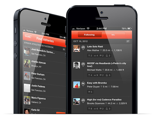
Strava's iphone app
Strava’s latest iPhone app is packed full of social features and content

Socialization is an incredibly powerful, market-changing concept. It’s there to be harnessed: our users now carry better gadgets than our companies ever lent them, and they interact with them in more aspects of their lives than the IT industry ever really imagined they would.

People like to collaborate, compare, convey their stories and experiences. They like to see the admire the achievements of others and to learn what is achievable. It’s motivating and it’s fun.

These concepts are a huge disruptor. They have changed sector after sector, and they’ll change ours.

Great service can come from simple ideas

Simple Idea, Great Service

This isn’t ITSM, but it’s a lovely example of a simple, quick idea that delivers real value.

My home town of Reading is served by a pretty good local public transport network. A number of its modern, double-decker bus routes serve the town’s Railway station, a major national rail interchange.

However, this is Great Britain, where almost every piece of transport infrastructure is run by a different company to the one next to it. They are not well known for working well together, and services and information are usually very disjointed.

These screens on Reading’s buses predominantly show advertising. Recently, though, as buses near the railway station, this screen has begun to appear.

It’s nothing more than a quick, realtime view of upcoming train departures, something that can be sourced from the National Rail website.

It’s a simple but clever idea, probably relatively straightforward to implement on a wi-fi enabled bus (I told you we had a good bus network!).  Reading is a commuter-town, and now we know about the status of the service before we’ve arrived (which can be important on a day like today!). We know whether we have time to grab that coffee, or whether we need to rush for the next fast train.

This speaks to me of a company that has really thought about its customers. It puts valuable information right in front of the the people who need it, at the precise moment they need it. Simple, easy, and very effective.

Painted into a Corner: Why Software Licensing isn’t getting simpler

It’s not easy being a Software License Manager.

It’s really not easy being a Software License Manager in a company which uses products from one or more of the “usual suspects” among the major software vendors.  Some of the largest have spent recent years creating a licensing puzzle of staggering complexity.

There’s an optimistic school of thought which supposes that the next big change in the software industry – a shift to service-oriented, cloud-based software delivery – will make this particular challenge go away.  But how true is this? To answer the question, we need to take a look back, and understand how we arrived at the current problem.

In short, today’s complexity was driven by the last big industry megatrend: virtualization.

In an old-fashioned datacenter, licensing was pretty straightforward.  You’re running our software on a box?  License that box,  please.  Some boxes have got bigger?  Okay, count the CPUs, thanks. It was nothing that should have been a big issue for an organized Asset Manager with an effective discovery tool.  But as servers started to look a bit less like, well, servers, things changed, and it was a change that became rather dramatic.

The same humming metal boxes were still there in the data center, but the operating system instances they were supporting had become much more difficult to pin down.  Software vendors found themselves in a tricky situation, because suddenly there were plenty of options to tweak the infrastructure to deliver the same amount of software at a lower license cost. This, of course, posed a direct threat to revenues.

The license models had to be changed, and quickly. The result was a new set of metrics, based on assessment of the actual capacity delivered, rather than on direct counting of physical components.

In 2006, in line with a ramping-up of the processor core count in its Power5 server offering, IBM announced its new licensing rules.We want customers to think in terms of ‘processor value units’ instead of cores”, said their spokesman. A key message was simplification, but that was at best debatable:  CPUs and cores can be counted, whereas processor-specific unit costs have to be looked-up.  And note the timing: This was not something that arrived with the first Power5 servers. It was well into the lifetime of that particular product line.  Oh, and by the way, older environments like Power4 were brought into the model, too.

And what about the costs?  “This is not a pricing action. We aren’t changing prices”. added the spokesman.

For a vendor, that assertion is important. Changing pricing frameworks is a dangerous game for software companies, even if on paper it looks like a zero-sum game.  The consequences of deviating significantly around the current mean can be severe:  The customers whose prices rise tend to leave. Those whose prices drop pay you less.  Balance isn’t enough – you need to make it smooth for every customer.

Of course, virtualization didn’t stand still from August 2006 onwards, and hence neither did the license models.  With customers often using increasingly sophisticated data centers, built on large physical platforms, the actual processing capacity allocated to software might be significantly less than the total capacity of the server farm.  You can’t get away with charging for hundreds of processors where software is perhaps running on a handful of VMs.

So once again, those license models needed to change.  And, as is typical for revisions like this, sub-capacity licensing was achieved through the addition of more details, and more rules.  It was pretty much impossible to make any such change reductive.

This trend has continued:  IBM’s Passport Advantage framework, at the time of writing, has an astonishing  46 different scenarios modelled in its processor value unit counting rules, and this number keeps increasing as new virtualization technologies are released. Most aren’t simple to measure: the Asset Manager needs access to a number of detailed facts and statistics.  Cores, CPUs, capacity caps, partitioning, the ability of VMs to leap from one physical box to another – all of these and more may be involved in the complex calculations. Simply getting hold of the raw data is a big challenge.

Another problem for the Software Asset Manager is the fact that there is often a significant and annoying lag between the emergence of a new technology, and the revision of software pricing models to fit it. In 2006, Amazon transformed IT infrastructure with their cloud offering. Oracle’s guidelines for applying its licensing rules in that environment only date back to 2008. Until the models are clarified, there’s ambiguity. Afterwards, there are more rules to account for.

(Incidentally, this problem is not limited to server-based software.  A literal interpretation of many desktop applications’ EULAs can be quite frightening for companies using widespread thin-client deployment. You might only have one user licensed to work with a specialist tool, but if they can theoretically open it on all 50,000 devices in the company, a bad-tempered auditor might be within their rights to demand 50,000 licenses.)

License models catch up slowly, and they catch up reactively, only when vendors feel the pressure to change them. This highlights another problem: despite the fine efforts of industry bodies like the SAM Standards Working Group, vendors have not found a way to collaborate.  As the IBM spokesman put it in that initial announcement: “We can’t tell the other vendors how to do their pricing structure”.

As a result, the problem is not just that these license models are complex.  There are also lots of them.  Despite fundamentally measuring the same thing, Oracle’s Processor Core Factors are completely different to IBM’s Processor Value Units.  Each vendor deals with sub-capacity in its own way, not just in terms of counting rules but even in terms of which virtual systems can be costed on this basis. Running stuff in the cloud? There are still endless uncertainties and ambiguities.  Each vendor is playing a constant game of catch-up, and they’re each separately writing their own own rules for the game. And meanwhile, their auditors knock on the door more and more.

Customers, of course, want simplification. But the industry is not delivering it. And the key problem is that pricing challenge.  A YouTube video from 2009 shows Microsoft’s Steve Ballmer responding to a customer looking for a simpler set of license models.  An edited transcript is as follows:

Questioner:

Particularly in application virtualization and general virtualization, some of Microsoft’s licensing is full of challenging fine print…

…I would appreciate your thoughts on simplifying the licensing applications and the licensing policies.”

Ballmer:

“I don’t anticipate a big round of simplifying our licenses.  It turns out every time you simplify something, you get rid of something.  And usually what we get rid of, somebody has used to keep their prices down…

…The last round of simplification we did of licensing was six years ago…. it turned out that a lot of the footnotes, a lot of the fine print,  a lot of the caveats, were there because somebody had used them to reduce their costs…

…I know we would all like the goal to be simplification, but I think the goal is simplification without price increase. And our shareholders would like it to be a simplification without price decreases”…

…I’d say we succeeded on simplification, and our customer satisfaction numbers plummeted for two and a half years”.

In engineering circles there is a wise saying: “Strong, light, cheap: Pick any two”. The lesson from the last few years in IT  is that we can apply a similar mantra to software licensing:  Simple, Flexible, Consistently Priced: Pick any two.

Vendors have almost always chosen the latter two.

This brings us to the present day, and the next great trend in the industry. According to IDC’s 2011 Software Licensing and Pricing survey, a significant majority of the new commercial applications brought to market in 2012 will be built for the Cloud. Vendors are seeing declining revenues from perpetual license models, while subscription-based revenue increases. Some commentators view this as a trend that will lead to the simplification of software license management. After all, people are easier to count than dynamic infrastructure… right?

However, for this simplification to occur, the previous pattern has to change, and it’s not showing any sign of doing so.  The IDC survey reported that nearly half of the vendors who are imminently moving to usage-based pricing models still had no means to track that usage. But no tracking will mean no revenue, so we know they’ll need to implement something. Once again, the software industry is in an individual and reactive state, rather than a collaborative one, and that will mean different metrics, multiple data collection tools, and a new set of complex challenges for the software asset manager.

And usage based pricing is no guarantee of simplicity. A glance at the Platform-as-as-Service sector illustrates this problem neatly. Microsoft’s Azure, announced in 2009 and launched in 2010, promised new flexibility and scalability… and simplicity. But again, flexibility and simplicity don’t seem to be sitting well together.

To work out the price of an Azure service, the Asset Manager needs to understand a huge range of facts, including (but by no means limited to) usage times, usage volumes, and secondary options such as caching (both performance and geographic), messaging and storage.  Got all that?  Good, because now we have to get to grips with the contractual complications: MSDN subscriptions have to be accounted for, along with the impact of any existing Enterprise Agreements. Microsoft recognized the challenge and provided a handy calculator, only to acknowledge that “you will most likely find that the details of your scenario warrant a more comprehensive solution”. Simplicity, Flexibility, Consistent Pricing: Pick any two.

And, of course, the old models won’t go away either. Even in a service-oriented future, there will still be on-premise IT, particularly amongst the organizations providing those services.

Software vendors have painted themselves into a corner with their license models, and unless they can find a way to break that pattern, we face a real risk that the license management challenge will get even more complex. Entrenched complexity in the on-premise sector will be joined by a new set of challenges in the cloud.

The pattern needs to change. If it doesn’t change, be nice to your Software Asset Manager. They’ll need a coffee.

Ticket Tennis

The game starts when something breaks.

A service is running slowly, and the sounds of a room full of frustration echo down a phone line. Somewhere, business has expensively stopped, amid a mess of lagging screens and pounded keyboards.

The helpdesk technician provides sympathetic reassurance, gathers some detail, thinks for a moment, and passes the issue on. A nice serve, smooth and clean, nothing to trouble the line judges here.

THUD!

And it’s over to the application team.  For a while.

“It’s not us. There’s nothing in the error logs. They’re as clean as a whistle”.

Plant feet, watch the ball…

WHACK!

Linux Server Support. Sure footed and alert, almost nimble (it’s all that dashing around those tight right-angle corners in the data center).  But no, it seems this one’s not for them.

“CPU usage is normal, and there’s plenty of space on the system partition”.

SLICE!

The networks team alertly receive it.  “It can’t be down to us.  Everything’s flowing smoothly, and anyway we degaussed the sockets earlier”. (Bear with me. I was never very good at networking).

“Anyway, it’s slow for us, too. It must be an application problem”.

BIFF!

Back to the application team it goes.   But they’re waiting right at the net.  “Last time this was a RAID problem”, someone offers.

CLOUT!

…and it’s a swift volley to the storage team.

I love describing this situation in a presentation, partly because it’s fun to embellish it with a bit of bouncy time-and-motion.  Mostly, though, it’s because most people in the room (at the very least, those whose glasses of water I’ve not just knocked over) seem to laugh and nod at the familiarity of it all.

Often, something dramatic has to happen to get things fixed. Calls are made, managers are shouted at, and things escalate.  Eventually people are made to sit round the same table, the issue is thrashed out, and finally a bit of co-operation brings a swift resolution.

You see, it turns out that the servers are missing a patch, which is causing new application updates to fail, but they can’t write to the log files because the network isn’t correctly routing around the SAN fabric that was taken down for maintenance which has overrun. It took a group of people, working together, armed with proper information on the interdependent parts of the service, to join the dots.

Would this series of mistakes seem normal in other lines of work?  Okay, it still happens sometimes, but in general most people are very capable of actually getting together to fix problems and make decisions.   Round table meetings, group emails and conference calls are nothing new. When we want to chat about something, it’s easy.  If we want to know who’s able to talk right now, it’s right there in our office communicator tools and on our mobile phones:

It’s hard to explain why so many service management tools remain stuck in a clumsy world of single assignments, opaque availability, and uncoordinated actions.  Big problems don’t get fixed quickly if the normal pattern is to whack them over the net in the hope that they don’t come back.

Fixing stuff needs collaboration, not ticket tennis. I’ve really been enjoying demonstrating the collaboration tools in our latest Service Desk product.  Chat simply makes sense.  Common views of the services we’re providing customers simply make sense.  It demos great, works great, and quite frankly, it all seems rather obvious.

Photo courtesy of MeddyGarnet, licensed under Creative Commons.